
Benchmarking
Benchmarking provides context for a merchant's financial performance by comparing revenue, expenses, and fintech activity against anonymized peers. This helps underwriters quickly determine whether the merchant is performing in line with, above, or below similar businesses.
Early accessThe expanded benchmarking peer groups feature is available through Early Access. To enable either feature for your organization, contact your Account Manager.
You can refine the peer group across three dimensions to ensure the comparison reflects the right context for the file you are reviewing:
- Time window: Limit the comparison to a specific date range.
- Geography: Scope peers nationally, by state, or by Metropolitan Statistical Area (MSA).
- Industry granularity: Adjust the NAICS classification from a broad sector from
naics2_codethroughnaics6_code.
It gives underwriters a simple, visual way to answer questions like:
- Is this revenue level high or low for this type of business?
- Are these expenses normal?
- Is this fintech borrowing activity consistent with peers?
By surfacing this insight directly inside the Dashboard, underwriters can make more informed decisions without manual research, external data, or statistical expertise.
Feature overview
Benchmarking appears as an interactive chart in the Ocrolus Dashboard under the Ocrolus Intelligence (OI) tab. The benchmarking advantages include:
- Contextualize borrower performance: Benchmark a business’s revenue, expenses, and fintech inflows and outflows against thousands of peers in the same industry and month, helping assess financial health in relative terms, not just absolute numbers.
- Enhance underwriting with percentile analytics: Percentile ranks (e.g., 80th percentile in revenue) allow underwriters to quickly determine whether a borrower is outperforming, underperforming, or in line with peers, streamlining decision-making and highlighting outliers.
- Backed by real-world SMB data: Benchmarking insights are derived from Ocrolus’ unique dataset of small business financial activity, aggregated across thousands of anonymized businesses—enabling clients to gain comparative intelligence unavailable through other sources.
- Powered by robust infrastructure: Benchmarking leverages datasets built from millions of SMB transactions, ensuring scalable and low-latency percentile calculations across key metrics.
The benchmarking screen on the Dashboard includes the following components:
- Industry benchmark curve (peer distribution chart): Visualizes the distribution of peer performance for the selected metric.
- Merchant marker (your merchant’s position): Indicates where the merchant falls within the peer distribution.
- Peer group controls: Lets you define the peer group by setting the time window, geography, and industry granularity so the comparison reflects the most relevant businesses.
- Multi-metric layout: Lets you view up to four metrics side by side, with each panel displaying an independent metric against the same peer group.
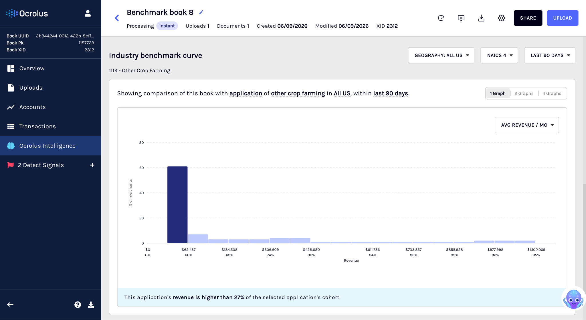
Industry benchmark curve
The benchmark curve is the core of the feature. It provides a simple, visual view of how businesses in the same industry typically perform, so you can quickly understand what it looks like before evaluating the merchant. Also, you don’t need to interpret percentiles mathematically. These markers are simply visual guides to help you understand how the merchant compares to similar businesses. This section shows the following details:
| Element | What it shows | Why it matters |
|---|---|---|
| Peer distribution (bars) | How peer businesses are distributed across performance ranges (for example, most businesses may fall between $40K–$80K monthly revenue). | Helps you quickly identify where most similar businesses fall, so you can interpret the merchant’s numbers in context. |
| Dollar ranges (x-axis) | The value ranges for the selected metric (for example, revenue amounts). | Makes it easier to determine whether the merchant is in a low, typical, or high-performing range. |
| Peer concentration (bar height) | The number of peers that fall within each range. Taller bars indicate higher concentration. | Lets you quickly see which ranges are most common across the industry. |
| Percentile markers | Reference points such as 5%, 25%, 50% (industry median), 75%, and 95%. | Gives you a quick way to understand whether the merchant is above or below most peers, without needing to calculate anything. |
Merchant marker
The dark blue column highlights where the merchant falls within the peer distribution. It helps you quickly understand whether the merchant is performing below, within, or above the typical range for similar businesses. The section contains the following details:
| Element | Description |
|---|---|
| Marker position | Indicates where the merchant’s value falls on the benchmark curve relative to peers. |
| Marker label | Displays the merchant’s average monthly value for the selected metric and how it ranks compared to peers. |
Example marker label$152,376 — Higher than 77% of peers. This gives you a clear, actionable takeaway without needing to interpret the full curve.
Boundary cases
To ensure the merchant is always represented on the chart, benchmarking uses the following labels when the merchant falls outside the typical peer range, making it easier to recognize extreme outliers at a glance:
- Below the 5th percentile:
< 5% - Above the 95th percentile:
> 95%
Customize peer group
Benchmarking lets you define the peer group a merchant is compared against, so the comparison reflects businesses that are genuinely similar, not just any business sharing a broad industry code. You can tune the peer group across three dimensions.
| Dimension | Options | Default |
|---|---|---|
| Time window | Rolling window from the Book's creation date: 30, 60, 90, 180, 270, or 365 days | 90 days |
| Geography | National, State, or MSA (metropolitan statistical area) | National |
| Industry granularity | NAICS 2 (broadest), NAICS 4, or NAICS 6 (most specific) | NAICS 4 |
Benchmarking builds the peer group from the combination you select, then recalculates the distribution, percentiles, and merchant marker for every chart on screen.
TipStart with the defaults (90 days, National, NAICS 4). Narrow to State or MSA, or to NAICS 6, when you want a tighter comparison for a local or specialized business. Widen the time window for a seasonal merchant whose recent months alone may not reflect typical performance.
Minimum peer group size
A peer group requires at least 30 Books to produce a reliable comparison. Benchmarking only computes results when this threshold is met.
- Dimension combinations that would produce a peer group below 30 Books are disabled, so you cannot select a comparison the data cannot support.
- Available options update as you change dimensions. Narrowing one dimension may disable options in another to keep the selection valid.
- If the default peer group itself falls below the threshold, the chart shows an error state instead of a comparison.
Multi-metric layout
You can view benchmarking in a single, two, or four-graph layout. Each panel displays its own metric, so you can compare, for example, revenue against fintech outflows side by side.
- Choose a metric independently for each panel.
- All panels use the same peer-group dimensions, so every comparison is consistent.
- Changing a dimension updates every visible panel at once. Changing a metric updates only that panel.
- Your layout choice is saved for your organization and persists across sessions.
TipThe single-graph layout is the default layout.
Using benchmarking for underwriting
Benchmarking gives you instant context for a merchant's cash flow by comparing it against similar businesses. Instead of assessing raw numbers in isolation, you can see at a glance whether a merchant's performance is typical, strong, or potentially concerning — and make faster, better-supported decisions as a result.
What you can do with benchmarking
You can perform the following activities using benchmarking:
- Get instant industry context: See whether a merchant's revenue, expenses, and fintech activity fall within the expected range for their industry, without manual research or external tools.
- Spot unusual patterns early: Identify outliers such as unusually high expenses or elevated fintech borrowing before they become a problem. Early visibility helps you decide whether a closer review is warranted.
- Support decisions with objective data: Percentile-based benchmarks give you an industry-relative reference point to strengthen approval or decline decisions, moving beyond intuition to evidence.
- Reduce reliance on guesswork: Peer benchmarks help you define what "normal" looks like for a given industry, so your assessment is grounded in real data rather than experience alone.
When benchmarking is most useful
Benchmarking is particularly valuable for merchants where raw numbers can be harder to interpret:
| Merchant type | Why benchmarking helps |
|---|---|
| Seasonal businesses | Puts month-to-month fluctuations in the context of industry patterns |
| Niche or small-industry merchants | Provides a relevant peer group when comparable data is otherwise hard to find |
| New merchants | Adds context when operating history is limited |
| Merchants with volatile activity | Distinguishes genuine outliers from typical variation within the industry |
Supported metrics
The following metrics are available for benchmarking. Each metric is compared against peers in the same industry, based on the NAICS level you select.
| Metric | What it measures |
|---|---|
| Revenue | Total money coming into the business from its core operations |
| Expenses | Total money going out of the business for operational costs |
| Fintech inflows | Funds received through fintech lending platforms |
| Fintech outflows | Repayments and other outgoing payments made to fintech lenders |
Benchmarking via API
Use the Benchmarking API to programmatically retrieve retrieve benchmarking percentiles for SMB Book.
Updated 21 days ago